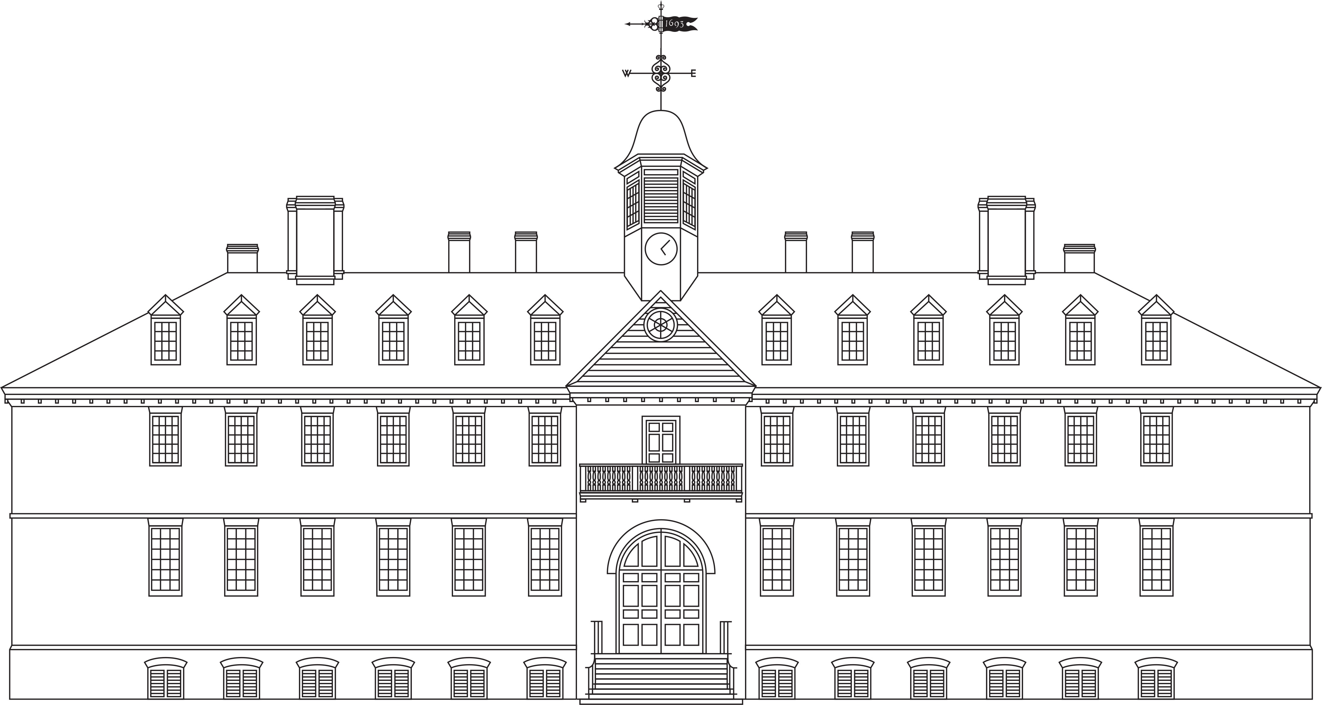
William & Mary maintains various visuals that are used as graphic assets in university communications. Whereas a logo provides primary branding for communication, graphic assets are supplementary visuals. They are not intended to act as logos or to replace the university logo, but to help communicators complement the university logo with additional creative artwork and connect to visuals on campus.
The 1693 Weathervane
The Sir Christopher Wren Building is one of America’s oldest academic buildings and is William & Mary’s most iconic piece of architecture. The 1693 Weathervane is an illustration of the weathervane that sits atop the Wren Building.
Color
The 1693 Weathervane must always appear in a single color, and may appear in in any of the primary or secondary university colors, in black or in white. The weathervane must never be used to provide primary branding to a piece of communication. It should never be used in place of the William & Mary logo, and it should not be relied upon to communicate that a piece of communication came from William & Mary. It is an illustration used to reinforce key William & Mary messages.
The Crim Dell bridge
As the heart of campus tradition and folklore, the Crim Dell bridge rests at the center of the university and is one of William & Mary’s most beloved features.
Color
The Crim Dell bridge must always appear in a single color, and may appear in any of the primary or secondary university colors, in black or in white. The Crim Dell bridge must never be used in place of the William & Mary logo, and it should not be relied upon to communicate that a piece of communication came from William & Mary.
The Cypher as graphic
In addition to its prominence in the university logo, the cypher may be used as a decorative graphic. The cypher should never be altered or recreated. In addition, elements of the cypher (such as the crown) must never be used alone as a graphic.
Color
The cypher must always appear in a single color, and may appear in any of the primary or secondary university colors, in black or in white. On its own, the cypher works best as a graphic rather than a logo. Whereas a logo provides primary branding for communication, a graphic is a supplementary visual. Although distinguishing between use as a logo and use as a graphic is somewhat subjective, campus communicators are called upon to make this distinction.
Campus architecture line art
William & Mary is known for its many beautiful buildings. Line art illustrations of many buildings are provided for use as supplementary graphic assets in communications. There are no color restrictions when using the architecture line art.


