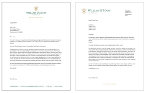
Letterhead design
Official William & Mary letterhead comes in two designs, one with the university’s vertical single-line logo centered and the other with the horizontal single-line logo on the left. William & Mary letterhead is clean and minimalist. The design provides simple branding and encourages campus units to provide only necessary contact information. Do not produce letterhead with alternate designs or with the vertical stacked logo.
Letterhead Format
In the vertical single-line logo design, the unit name appears at the top center of the page, just below the logo. Contact information for the campus unit appears in the page footer in William & Mary Green serif type. Each individual piece of contact information is separated from the next by four spaces, a bullet and four additional spaces.
In the horizontal single-line logo design, the unit name and contact information appears on the right side of the header in black sans-serif type. The footer is reserved for a message or tagline associated with that campus unit. The message or tagline is displayed in all caps and should appear in William & Mary Gold sans-serif type.
Telephone numbers for both designs enclose area codes in parentheses and use a dash instead of a period to separate number groupings (e.g. (757) 221-2000). Campus units are strongly encouraged to thoughtfully limit the amount of contact information provided rather than cluttering the page with all possible forms of contact information.
Placement of copy
Body text for the vertical single-line logo design should employ 1″ side margins and should begin .5″ below the placement of the logo or sub-brand. Body text should be in black.
Copy for the horizontal single-line logo design should employ a 1.64″ left margin, a 1″ right margin and should begin .5″ below the last line of contact information in the header.
Business cards
The William & Mary business card must accommodate differences in length of name, variation in number of titles and inclusion of additional contact information. To this end, the university makes two front designs and two back designs available. Individuals may choose the front/back combination that best works for them.
Business cards may be ordered from Virginia Correctional Enterprises through eVA or three additional printing partners including the W&M Print Shop. Learn more about the purchasing options for business cards.
Front design one: two-column layout
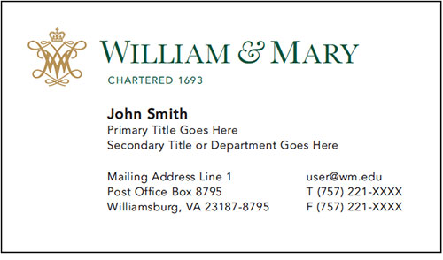
The two-column layout works best for individuals with short email addresses.
The only aspect of the two-column layout that should be altered is the content respective to the individual. Margins, text size, text weight, leading, colors and the university logo are not to be altered.
Telephone numbers enclose the area code in parentheses and separate the number groupings with a dash rather than a period.
Front design two: one-column layout
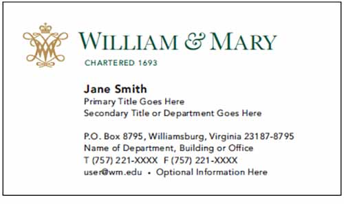
The one-column layout works best for individuals with long email addresses.
The only aspect of the one-column layout that should be altered is the content respective to the individual. Margins, text size, text weight, leading, colors and the university logo are not to be altered.
Telephone numbers enclose the area code in parentheses and separate the number groupings with a dash rather than a period.
Back design one: website with contact information
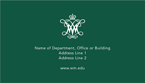
The back of the William & Mary business card is designed to make a visual impact. The white space accompanying the cypher and web address is crucial to maintaining a professional feel.
The website with contact information design should only be altered to change the contact information and specific web address (if desired). As with the front of the card, margins, text size, text weight, leading, colors and the cypher are not to be altered.
Back design two: website only

The website only design should only be altered to change the specific web address (if desired).
