William & Mary is one of America’s treasured, historic and prestigious universities. The William & Mary logo reflects the excellence, class, tradition and strength unique to this campus. The logo is a single piece of artwork that combines the university’s rich past with its bright future.
As finished artwork, the logo should never be altered or recreated. All W&M communications should use official logo files found in Downloads.

Basic Guidelines
As the university’s primary visual communication tool, the William & Mary logo must adhere to a basic set of consistent presentation specifications.
Colors

The cypher appears in William & Mary Gold (Pantone 465). Both the wordmark and the year of charter appear in William & Mary Green (Pantone 343).
Minimum Size
In order to preserve legibility and prominence, the university logo must never be used in widths smaller than 1.75” (print) and 170 px (digital). There is no maximum width specified for the logo.
Clear Space

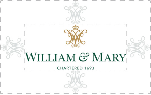
The university logo must appear in a professional manner, unencumbered by and set apart from additional graphics, images and text. In order to accomplish this, W&M communicators must follow the spatial guidelines illustrated. Use the size of the cypher as a measuring tool.
Acceptable Logo Variations
Diverse communication efforts require flexibility in portraying the university logo. The two acceptable variations are considered secondary, to be used only when the primary mark proves inadequate. Additional variations unmentioned here are not acceptable.
The vertical, stacked version of the logo should be used when the available space is tall and narrow. “Vertical” refers to the positioning relationship between the cypher and wordmark, and “stacked” refers to the depiction of the wordmark. The minimum width for the vertical stacked logo is 7/8″ (print) and 100px (digital).
The horizontal, single-line version of the logo should be used when the available space is short and wide. “Horizontal” refers to the positioning relationship between the cypher and the wordmark, and “single-line” refers to the depiction of the wordmark. The minimum width for the horizontal single-line logo is 2.25″ (print) and 250px (digital).
Prohibited Logo Alterations
Any and all alterations of the university logo other than the acceptable colorizations cited on this site are prohibited. This includes using alternate fonts, substituting graphics, changing proportions of logo elements, and all other alterations. The university logo and its accepted variations are finished pieces of artwork and should never be recreated.
Acceptable Color Variations
In addition to the primary colorization of the logo displayed above, the university logo may be displayed entirely in W&M Green, W&M Gold, W&M Silver, in black or in white. The logo may also be displayed with the cypher in W&M Gold and the wordmark and year of charter in white. All other color variations are prohibited.
When Space is Limited
Wordmark-Only Branding
When space is limited for branding, the university wordmark is the recommended solution. In such instances, the wordmark should appear without the year of charter. Maintaining the year of charter without the cypher gives the impression that the cypher was forgotten. Displaying just the wordmark, however, communicates a more intentional, simple branding.
The wordmark may appear in the single-line or stacked version, and in any of the primary or secondary university colors, as well as in black or white for one-color printing purposes. Never display the wordmark in any other colors (pink, purple, blue, red, etc.).
Cypher-Only Branding
The university cypher alone may provide branding in restricted instances. For any application confined to the university’s physical campus, the cypher may provide branding. Examples of appropriate cypher-only branding include building signage, campus floor murals, default screen savers in university computer labs and similar stationary applications.
Additionally, for any uniquely small application, the cypher may provide branding. Examples of uniquely small applications include lapel pins, cuff links, wristwatch faces and applications of similar size and shape.
The cypher alone may not provide branding for portable applications or applications likely to be seen by an off-campus audience. In such instances, the cypher communicates best when paired with the university wordmark. Examples of inappropriate cypher-only branding include publications, merchandise and digital communications.
Although using the cypher to provide branding is restricted to on-campus and uniquely small applications, the cypher can be used as a decorative graphic with less restriction. For more information on this type of use and on the distinction between using the cypher as a primary branding mark and using it as a decorative graphic, see Graphic Assets.
W&M
In certain contexts, particularly in the world of merchandise, “W&M” may stand in as substitute primary branding for the university logo. The official “W&M” is finished artwork and should never be recreated. The W&M must never appear without the ampersand, and substitutions of the ampersand in either its style or size are strictly prohibited.
Depiction
The primary depiction of W&M is comprised of the “W” and “M” in William & Mary Green and the “&” in William & Mary Gold on a white background. There are, however, acceptable variations of this when different background colors are used.
W&M may appear in a single color in any of the primary or secondary university colors, in black or in white. Additionally, the four official colors may be used to offset the ampersand from the color of the “W” and the “M.” However, offsetting the ampersand in one of the university’s two golds when the “W” and “M” are depicted in the other gold is prohibited.
Web Use
When William & Mary logos are used to brand websites and other digital communications, they must always link to the William & Mary homepage. Do not use university logos to link to the homepages of sub-brand websites.


